- Published on
Is Your App Ready for Foldable Phones?
Apple officially introduced the iPhone Duo on September 9. It is the first foldable iPhone, with a 5.4-inch outer display and a 7.6-inch inner display. Preorders start October 16, and the phone becomes available October 23.
That announcement changed the question for app owners. Foldables are no longer only an Android consideration or something to keep on a future roadmap. Apple is now building iOS around a device that moves between phone and tablet-like layouts while the app is still running.
Here is my short answer: your development team should start testing adaptive layouts now, but that does not mean every developer needs a $2,000 foldable. Start with the simulators and device data you already have. Buy physical hardware when your users, features, or transition behavior make it necessary.
What changed when Apple announced the iPhone Duo?
Before the announcement, it was reasonable to treat Apple's foldable as a rumor. That is no longer the case.
Apple says iOS 27 changes content as the Duo folds, reorients, and switches between displays. It also introduces Split View on iPhone, so two apps can appear side by side on the inner screen. Apple is updating Xcode's Device Hub to support the new hardware as well.
The important part is not the device name. It is the new expectation.
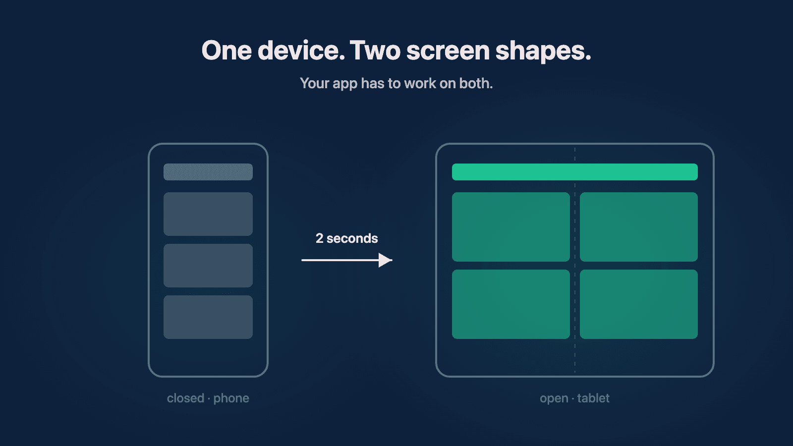
A customer can open your app on the outer display, unfold the phone, and expect the same session to continue on a much larger canvas. They can rotate it, place another app beside it, or move back to the outer screen. Your interface cannot assume that the width and height it received at launch will stay that way.
That expectation already exists on Android foldables. Apple's entry makes it relevant to a much broader part of the mobile market.
Does your team need to buy a foldable phone?
Probably not immediately, and definitely not one for every developer.
Apple and Google both provide tools for testing multiple window sizes without buying every device. Android Studio includes a resizable emulator and foldable controls. Xcode provides resizable previews and simulators, with dedicated iPhone Duo support coming through Device Hub.
Those tools are enough for the first pass. They can expose fixed widths, clipped text, broken navigation, layouts that waste the larger screen, and screens that fail when their available space changes.
Physical hardware becomes more valuable when:
- Your analytics show meaningful usage on foldables or large-screen devices.
- The app depends on cameras, sensors, multitasking, or posture-specific behavior.
- The unfold and refold transition is important to a core user journey.
- A simulator passes, but the team still needs confidence in touch, performance, or real-device behavior.
- The app is preparing for a high-stakes release on the new hardware.
One shared device may be enough. The decision should follow your product risk and customer data, not launch-day excitement.
What should you test when a phone unfolds?
Testing the app once while it is closed and once while it is open is not enough. The transition itself is a separate state.
I have used Android foldables where an app looked correct when opened on the large display but failed when I started on the cover screen and unfolded the phone. I have also seen the reverse. The layout was not the only problem. The app had to preserve state while the environment around it changed.
At minimum, I would test:
- Launching the app on the outer display.
- Unfolding while the app remains active.
- Refolding without restarting the app.
- Rotating in both the closed and open positions.
- Opening the app beside another app in a smaller window.
- Showing keyboards, sheets, menus, alerts, and media at each size.
- Returning from the background after the device changes posture.
Pay special attention to forms, navigation stacks, media playback, scroll position, and anything a user could lose. A layout that rearranges itself is inconvenient. A checkout, medical form, or work item that loses progress is a product failure.
Why is isMobile versus isTablet no longer enough?
Years ago, I worked on an app that made a simple decision: mobile or tablet. That worked well enough when those were separate devices with predictable dimensions.
A foldable breaks that assumption. It can be a compact phone, a tablet-sized screen, or a partial-width window depending on how the person is using it. Device identity tells you less than the space available to the current view.
Modern layout systems support this better when teams use them as intended. SwiftUI can react to size classes and changing available space. Jetpack Compose and Android's adaptive guidance are built around responsive layouts. React Native can share a codebase across phone and tablet layouts, but the team still has to avoid fixed-size assumptions and test how components rearrange.
The goal is not to force identical screens everywhere. It is to keep the same product understandable and usable while the layout changes.
Sometimes that means a single column becoming two. Sometimes navigation moves from the bottom to the side. A companion experience may intentionally show fewer capabilities on the smaller display. Those are product decisions, not just CSS or view-code decisions.
How should analytics influence the testing plan?
Start by checking what devices and screen sizes your customers already use. The exact threshold will be different for every product, but the principle is simple: the more customers and revenue exposed to a form factor, the more real-device confidence you need.
Do not wait for a large percentage before checking whether the app is fundamentally usable. A small group of high-value customers can matter more than a large group of casual users. At the same time, do not let a new hardware announcement force the entire roadmap to change if your product has little exposure and the emulator shows no urgent problem.
Track:
- Device model and operating-system version.
- Available window size, not only phone or tablet labels.
- Errors or abandoned sessions around orientation and size changes.
- Support requests that mention clipping, blank screens, or lost state.
- The business importance of the workflows affected.
That information helps you decide whether foldable work is a basic compatibility pass, a deeper product redesign, or simply something to monitor.
Will your current technology stack handle foldables?
React Native, SwiftUI, and Kotlin with Jetpack Compose can all support adaptive layouts. None of them guarantee that an existing app is adaptive just because the framework can do it.
The risk usually lives in the assumptions your team added over time:
- Fixed widths and heights.
- One navigation pattern for every screen size.
- State stored inside a view that gets recreated during a size change.
- Separate phone and tablet code that has drifted apart.
- Images, charts, or video players that only work at one aspect ratio.
- Features included on one layout without a clear product reason.
If the phone and tablet versions already share a well-structured codebase, the team may only need targeted fixes. If they have separate workflows that rarely receive the same updates, this is a good time to decide what should be shared and what should remain intentionally different.
The framework is not the strategy. Your product still needs rules for what moves, what grows, what stays visible, and what the user should be able to continue after the screen changes.
Can AI make the foldable update easier?
AI can help a team find fixed-size assumptions, propose adaptive components, generate test cases, and review changes. That can reduce some of the manual search involved in an older codebase.
It does not know which workflows matter most to your customers, and it cannot replace testing the real interaction.
I would use AI to support the work, then have qualified developers and QA verify the result. A generated layout that compiles can still clip content, lose state, or make the larger screen harder to use. The finished experience is what matters.
This is also where a technical audit can help. It can identify the fixed assumptions and transition risks before the team turns the work into a larger project. If you are starting a new app, adaptive behavior belongs in the initial build, not as a surprise after release.
What should an app owner ask the development team?
I would start with these questions:
- Does the app respond to available space, or does it branch only on phone versus tablet?
- Have we tested the same active session while unfolding, refolding, rotating, and resizing?
- Which screens still use fixed measurements or separate device-specific implementations?
- What user state could disappear during a layout transition?
- Do our analytics show who is already using large screens or foldables?
- Can we complete the first compatibility pass in simulators before buying hardware?
- What would make a physical device necessary for this product?
If the team can answer those clearly, you are probably in a good position. If nobody knows, the iPhone Duo announcement is a useful reason to find out.
I still do not know how quickly foldables will become mainstream. Samsung and Google have supported the category for years without making it the default phone shape. Apple can change adoption, but one announcement does not tell us what customers will buy over the next year.
What is no longer uncertain is the direction of the platforms. Phones, tablets, foldables, rotation, and multitasking are becoming one adaptive-layout problem. Your team does not need to panic or buy a pile of devices. It does need to understand how the app behaves when the screen stops staying the same size.
Need help with your project?
Chris Martinez
Founder of CAM Software · Mobile engineer
Chris founded CAM Software in 2022. He leads embedded product engineering engagements for established companies with mobile-led products, inherited applications, and delivery challenges. His work spans product alignment, React Native and native mobile engineering, supporting web and backend systems, release reliability, and responsible AI delivery. He also operates software products owned and operated by CAM Software from Northwest Arkansas and works with teams nationwide.